"Can we just see some logo options first?"
We hear it on almost every project, and we understand why. Logos are exciting. Strategy documents are not. But in our experience, brand projects rarely fail because the design was weak. They fail because the people approving it wanted different things and nobody noticed until the third round of revisions.
The short version: creative orientation is the step where everyone agrees on direction before anyone designs anything. This article explains what it is, why it saves time rather than costing it, and walks through a real orientation deck from our studio, sketches and all.
What creative orientation actually is
Creative orientation sits between brand strategy and design. Strategy tells you what the brand needs to do. Orientation turns that into something you can see, compare and choose.
In practice, it's a working session built around a deck. We bring what we've learned about the business, the audience and the market, and we shape it into two or three creative routes. Each route has its own idea, its own mood, and its own answers for colour, typography, illustration, interface and tone of voice. The client doesn't approve a logo. They choose a direction.
A good orientation leaves everyone with:
- a shared understanding of what the brand should mean
- a small set of keywords the whole team agrees on
- a clear choice between genuinely different creative routes
- a direction for naming and wordmark work, where it's needed
- agreement on what the design phase will and won't explore
Why alignment comes before design
A strong identity can't fix a leadership team that disagrees about what the company is. It just gives them something new to disagree about. Orientation moves that conversation to the start of the project, where it's cheap, instead of the end, where it's expensive.
| Without orientation | With orientation | |
|---|---|---|
| First concepts | Judged on personal taste | Judged against an agreed direction |
| Feedback | "Can we try something different?" | "Does this fit the route we chose?" |
| Revision rounds | Open-ended | Focused and fewer |
| Stakeholders | Aligned late, if at all | Aligned before design begins |
| The final brand | A compromise | A decision |
Inside a real orientation deck
Here's what this looks like in practice. In August 2023 we ran a creative orientation for GTP, the Global Talent Platform, a platform built to find and connect exceptionally gifted people in fields like mathematics, physics and engineering, and to bring sponsors and mentors around them.
Start from what's already been tried
The deck opened with a summary of three earlier directions: Acceleration, inspired by rally racing and lines of speed; 1%, focused on the top one percent of gifted minds; and Diversity, built on patterns from nature, science and mathematics. None of them was wrong. Each captured one part of GTP, and none captured the whole. Naming that honestly at the start is part of the job, because it shows the client what we're building on instead of pretending to start from zero.
Go wide, then focus
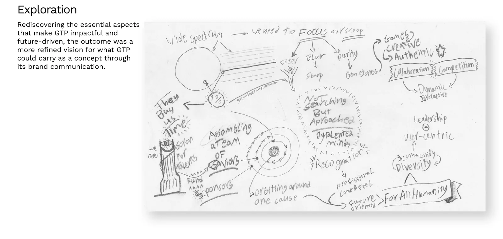
Next came the exploration sketch at the top of this article. It literally starts with "wide spectrum, we need to focus our scope." Around it are the ideas worth keeping: the top 1%, talented people who aren't searching but are approached, sponsors and funding, recognition, community and diversity, and one phrase that stuck: "orbiting around one cause."
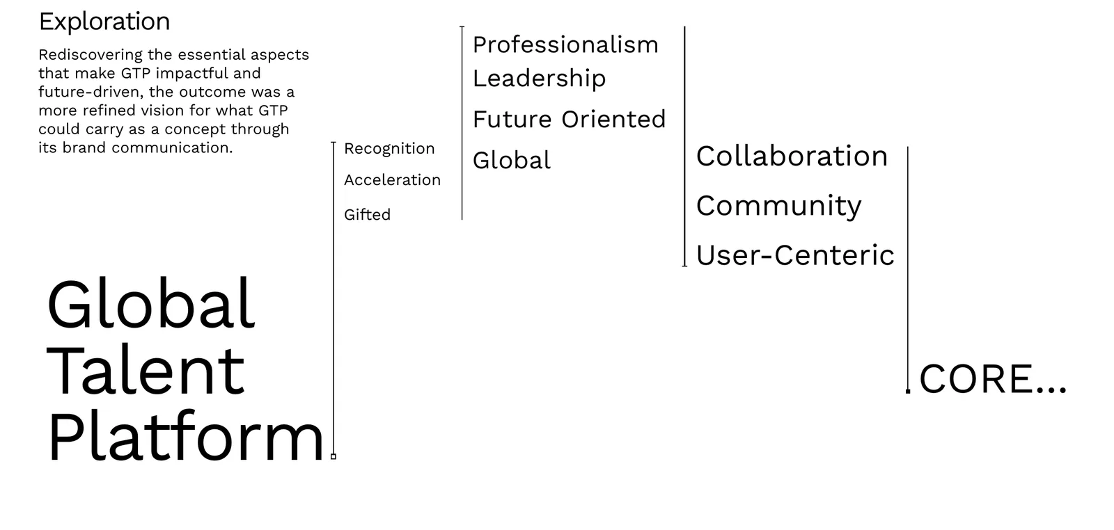
From there we filtered the ideas into layers of keywords. The first layer described what GTP offers: recognition, acceleration and gifted people. The next described how it should behave: professional, a leader, future-oriented and global. The last described what holds it together: collaboration, community and a user-centred experience. All of it pointed to one word in the middle: core.
Find the insight
That word became the insight: GTP is the core of its community. The deck explains it through physics, which suits a platform for scientists. A core affects the particles around it in two ways. It can hold them in orbit, creating a stable system that keeps working. Or it can pull them in, so they fuse into something constantly active and changing. Either way, the community grows around the centre.
Two effects, two creative routes. The first sketches for both fit on a single notebook page.
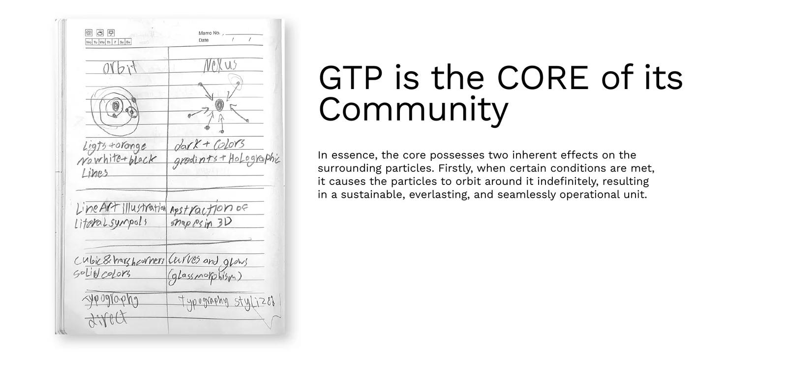
Two routes, one decision
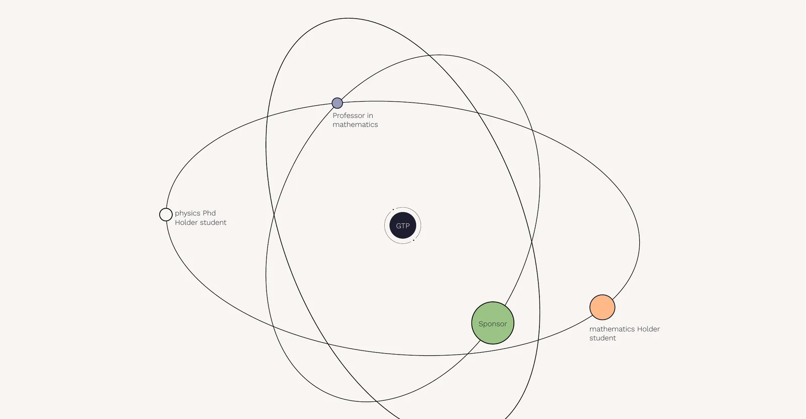
Route 01: Orbital
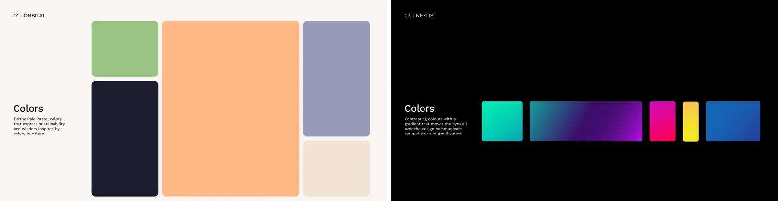
Orbital takes the first effect. GTP sits at the centre and the community moves around it: professors, PhD students, graduates and sponsors, each on their own path, all connected to the same core. The route is minimal but literal. Its illustrations use monoline scribbles and handwriting inspired by the notes STEM students make in their drafts, so the brand feels like it comes from inside the community. The palette is earthy and pale, the typography contrasts bold and thin weights, and the keywords are gifted, opportunity, novelty, collaboration, sustainability and dynamic.
Route 02: Nexus
Nexus takes the second effect. GTP is a core that attracts: talent, mentors and sponsors are pulled towards the centre, where they meet and something new happens. The route is abstract, vibrant and built on contrast, inspired by slow-motion footage of energy collisions like lightning and particle rays. Its keywords are networking, gamification, creativity, diversity, competition and vibrant, and its interface ideas lean towards challenges, leaderboards and exploration.
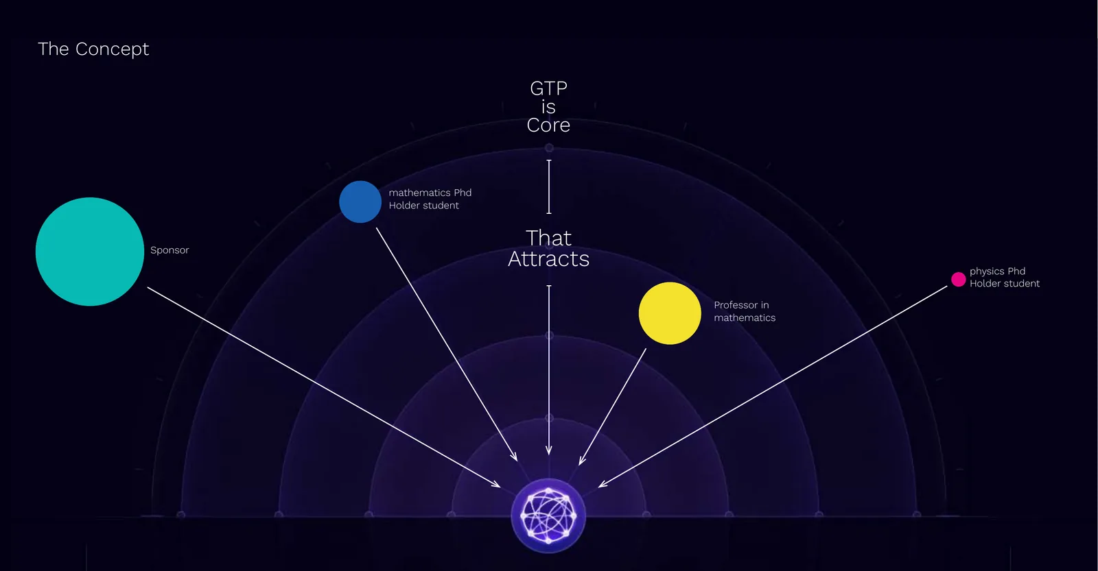
Put side by side, the difference is obvious before anyone reads a word. That's the point. A client choosing between these two isn't choosing a colour. They're choosing whether GTP feels like a calm, steady system or a place full of energy and competition.
Naming and wordmark direction
The deck closed with two practical chapters. One looked at wordmark logos, where the name itself carries the identity, which matters for a brand known by its initials. The other set out the naming techniques we use, so the naming conversation had a shared vocabulary:
| Technique | How it works |
|---|---|
| Acronym | Initials that stand for something bigger |
| Descriptive | A real word with a story behind it |
| Fabricated | Words combined or reshaped into a new one |
| Metaphor | A word borrowed from somewhere else for its meaning |
| Magic spell | Letters combined for sound and feel more than meaning |
Want to see how that works on a real name? Our naming service starts from exactly this kind of shared vocabulary.
How orientation shaped other Generator brands
Every project has its own version of this step. The deck looks different each time, but the job is the same: agree on the idea first, then design from it.
Arc de Sol, a premium furniture brand in Saudi Arabia, started with a naming process rooted in linguistic, cultural and symbolic exploration. The name was chosen to convey form, light and warmth, and that single idea set the design direction: simplicity, warm golden tones and subtle motion.
Tafeel, a Saudi digital transformation company, was oriented around one position: an enabler of possibilities, not just an installer of systems. Because everyone agreed on that early, it could inform every layer after it, from brand architecture and voice to the website interface.
Flair, a luxury floral boutique in Saudi Arabia, began with what flowers actually do for people: they say what words often can't. Agreeing on that idea is what led to a hoopoe for a logo instead of the rose everyone expected.
Orientation matters even more in a rebrand, where you also have to agree on what to keep. We cover that in our guide to working with a rebranding agency.
Where it sits in our services
Creative orientation isn't a separate product. It's the hinge that connects everything we do at Generator:
- Strategy gives orientation its raw material: research, audience insight and business goals.
- Branding & Positioning sharpens what the brand should stand for and where it competes.
- Design builds the identity from the chosen route: logo, type, colour and illustration.
- Experience carries the route into websites, apps and interfaces.
- Communication gives the brand its voice across content and campaigns.
You can see all of them on our services page.
How to prepare for an orientation
You'll get more out of the session if you come ready. A few things help:
- Bring the decision-makers. If the person with the final say isn't there, the direction you agree on can be undone later.
- Share what's been tried. Old logos, rejected concepts, previous agencies' work. It's all useful, even the bits you hated.
- Know your ambition. Where should the business be in five years? The brand has to fit that company, not today's.
- Come ready to choose. The session works best when it ends with a decision, not a list of things to think about.
Common questions
What is creative orientation in branding?
It's the stage between strategy and design where the client and the agency agree on direction. We turn research and business goals into a small number of clear creative routes, each with its own idea, mood, colour, type and tone, so everyone chooses a direction before any logo is drawn.
Is creative orientation the same as a moodboard?
No. A moodboard shows what something could look like. An orientation explains why. Every route starts from an idea about the brand, and the visuals are there to test that idea, not to replace it.
How many creative routes should an orientation have?
Usually two or three. Fewer than two and there's nothing to compare. More than three and the choice gets harder, not easier. Each route should be genuinely different, not three versions of the same idea.
Who should attend a creative orientation?
The people who will approve the final brand. If the person with the final say isn't in the room, the direction you agree on can be undone later, and that's where most endless revision rounds come from.
Does creative orientation slow a branding project down?
It adds a step at the start and usually saves several at the end. Agreeing on direction early means fewer rejected concepts, shorter feedback rounds and faster approvals once design begins.
Want to agree on the idea before the logo?
We'd be pleased to walk you through how we'd approach your brand, from the first sketch to the routes you'd choose between. Generator works with growing companies across Saudi Arabia and Egypt. It would be a pleasure to hear from you.
Explore our services Start a conversationGenerator Design Agency · Cairo, Egypt · Working across Saudi Arabia & Egypt · See more work · Our services