"Six months after launch, it looked like everyone else."
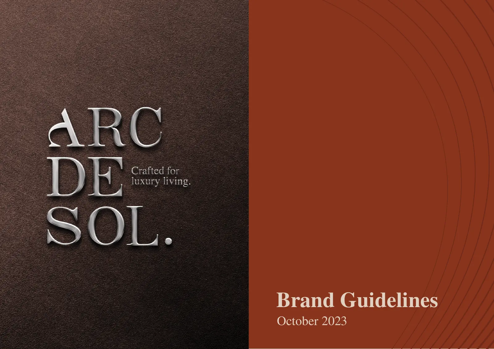
A brand can look beautiful and still be impossible to remember. The type is elegant, the colours are carefully chosen, the presentation is full of convincing mockups, and everyone in the room approves. Then the brand launches, and within a year it sits comfortably among its competitors, indistinguishable from them.
That is the most common misunderstanding about creative branding: originality is not decoration. What makes a brand distinctive is an idea, one specific enough to be recognised and strong enough to guide both its look and its feel: what people see, and how the brand speaks, moves and behaves everywhere they meet it. A creative branding agency in Egypt should be judged on whether it can find that idea, not on how attractive its mockups are. Below are three identities from our studio, each built from a very different idea.

Decoration is not an idea
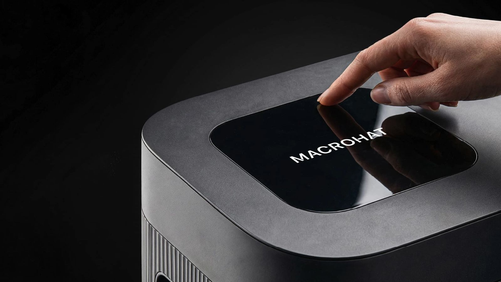
Imagine a technology company that wants to be seen as reliable, simple and confident. An agency could give it a striking identity: unusual typography, bright colours, complex illustration, experimental layouts. It would get attention. But if customers still can't tell what the company does or why to trust it, the creative work has failed at its main job.
The question is never whether a design is interesting. It is whether it carries the right idea to the right people. That is why creative work needs a clear strategy underneath it: audience, competitors, value and personality agreed before the first sketch. A good brief doesn't limit creativity. It gives it something worth solving.
What makes a brand distinctive
Distinctive doesn't mean louder or stranger than the competition. Sometimes the strongest decision is restraint; sometimes the brand needs expressive type, unexpected colour or a whole new visual world. The distinctive brands we work on share three things.
One central idea
Specific enough to own.
It can come from the name, the purpose, a cultural insight or the customer.
Ownable assets
More than a logo.
Type, colour, illustration, motion and voice that people learn to recognise.
Range with rules
Flexible, never random.
A system that adapts to every channel and still looks like itself.
Creative direction starts with a problem
One question tells you a lot about any creative brief: what problem is this direction supposed to solve? If the answer is "the brand needs to look modern," the brief isn't finished. Modern compared with whom, for which audience, to communicate which advantage, and how will it hold up when the trend moves on?
We start every identity with a creative orientation that aligns the team on that problem before concepts begin. Then the direction is tested on real applications, not only on presentation boards, because an identity has to work when the client's own team uses it on a Tuesday afternoon.
The three projects below came from three different problems, so they ended up looking nothing alike.
Studio ZAT: the art of becoming
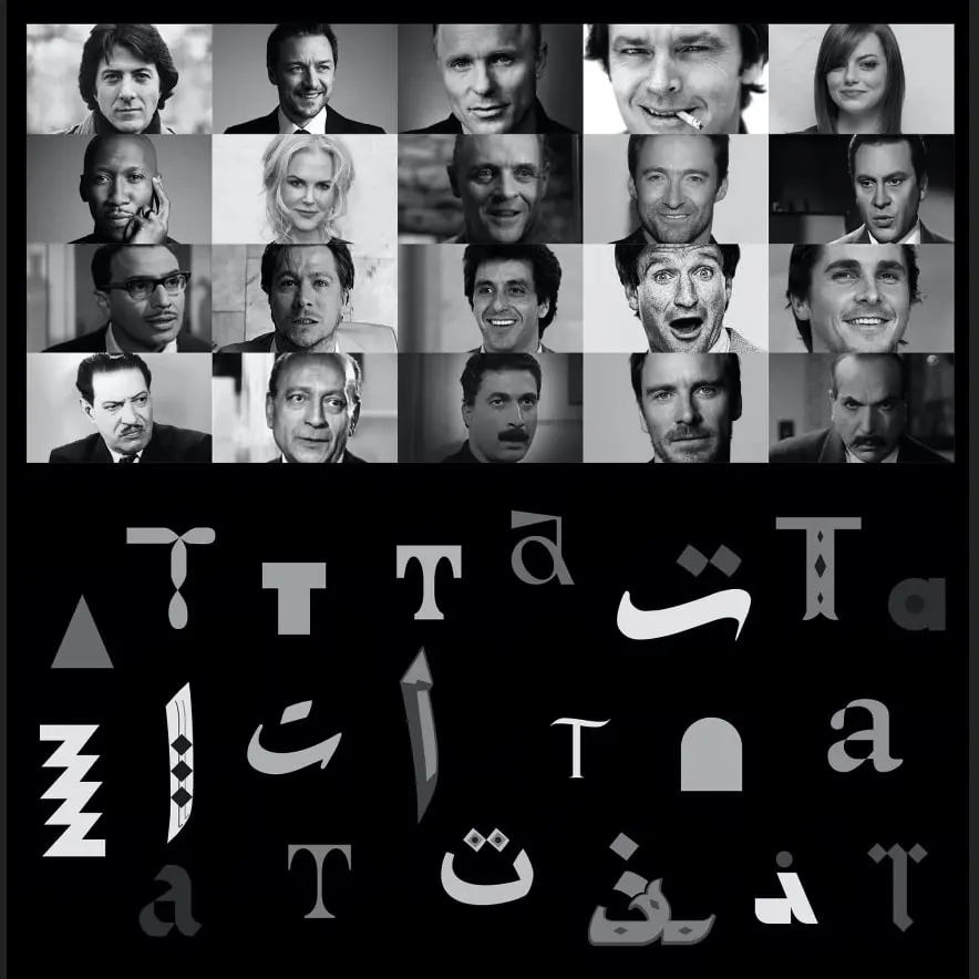
Studio ZAT is a creative platform for contemporary art cinema, acting education and independent expression, open to amateurs and professionals alike. Its brand had to hold two opposite things at once: the discipline of acting and the freedom of exploration, while feeling safe and inclusive enough for someone walking into their first workshop.
The idea we built on was the stage itself, where every person is a story waiting to be told, and the moment an actor becomes someone else. That idea produced a bold logotype that feels theatrical and contemporary, expressive typography that echoes an actor's emotional range, a warm and open palette, a website built to promote workshops, and guidelines that keep the brand consistent while leaving room for artistic variation.

ALZOMRA: Egyptian culture for children
ALZOMRA is the first Egyptian brand dedicated to making authentic Egyptian culture accessible and exciting for children, through weekly content that builds knowledge, adventure and discipline. We built the identity from scratch.
The creative tension was clear. Too traditional, and children would find it distant. Too playful without cultural substance, and it would lose its reason to exist. So the brand was defined as authentic, adventurous, disciplined, playful and modern at once. The logo blends traditional Egyptian symbolism with a sense of movement and discovery; a system of vibrant colour, hand-drawn icons and youthful type works across packaging, merchandise, digital and educational tools; and the copy turns complex cultural ideas into phrases children and parents remember.

249 Studio: music as a visual language
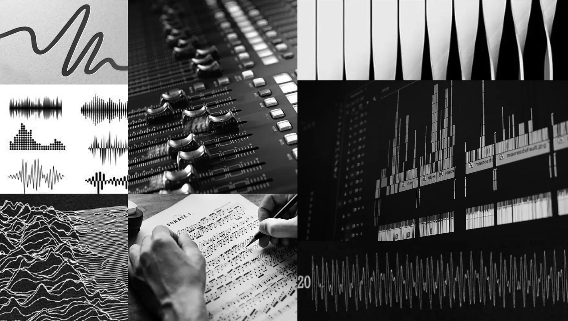
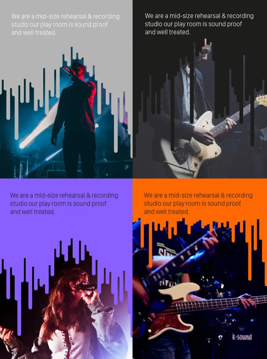
249 Studio is a rehearsal and recording studio for creators and performers. Instead of giving it a generic music look, we built the brand on one concept: that music itself can be a visual language.
The identity draws on harmonic intervals, the second, the perfect fourth and the tension of the ninth, so that every element carries emotion, contrast and rhythm. That concept guided the naming system, a fluid brandmark inspired by sound waves, a logotype that flows like a melody, a type and colour system built on contrast and tone, interactive motion, and the web and mobile experience. It is a brand that, in its own way, sounds like what it does.

From single designs to a brand system
Graphic design produces individual pieces: a campaign visual, a brochure, a post. Creative branding defines the language that makes all of those pieces, made by different people over different years, feel like one brand. That language covers the look, type, colour, composition and imagery, and the feel: the voice, the motion, the pace of a website and the way a box opens. The rules for how they work together are what make it a system.
The difference shows as a company grows. Once several teams and suppliers produce content, the brand needs a system that survives without its original designers in the room. That is what usable brand guidelines are for, and why every project above ended with them.
Where culture belongs in a brand
Creativity never happens outside culture. Language, symbols, humour, type and colour carry different meanings for different audiences. For brands in Egypt and the Gulf, cultural understanding has to shape the thinking from the start. That doesn't mean adding traditional patterns; used without a reason, they become ornament.
ALZOMRA shows the alternative: Egyptian heritage is the idea, not a decoration on top of it. For bilingual brands, the same principle means designing Arabic and English as one system, so neither feels like a translation of the other. We go deeper into that in our guide to bilingual Arabic logo design.

How to judge a creative direction
Whether you are reviewing your own brand or a new proposal, these questions separate an idea from decoration:
| Ask | A strong answer sounds like |
|---|---|
| Why does it look like this? | A reason rooted in the business or the audience, not taste or trend |
| What is the one idea? | A sentence anyone on the team can repeat |
| Could a competitor use it? | No, because it comes from something only this brand has |
| Does it work at small sizes and in Arabic? | Shown on real applications in both scripts |
| Can our team use it without the agency? | Guidelines, templates and clear rules |
If the direction you are reviewing is part of a bigger change, start by working out which kind of rebrand you actually need.
Where a creative branding agency earns its fee
The work is worth paying for when the idea is missing: a business that can't say in one sentence what makes it different, an identity it has quietly outgrown, or a new brand that needs something strong enough to build everything else on. Those are the projects where a central idea changes the outcome, as it did for Studio ZAT, ALZOMRA and 249 Studio.
It is harder to justify when the idea already exists. If your identity works and you simply need more of it, your money is better spent on templates and content than on new concepts. And if a launch date forces a logo before anyone has agreed what the brand stands for, a quick interim mark is more honest than a rushed "big idea." Our brand identity design work begins once that idea is worth finding.
Frequently asked questions
What does a creative branding agency do?
It turns a business's strategy and personality into a brand people recognise: the central idea, name, identity, typography, colour, illustration, motion, voice and the guidelines that keep it consistent. The best creative work starts from the strategy, not from a moodboard.
What is the difference between a creative agency and a branding agency?
A creative agency usually focuses on campaigns, content and advertising. A branding agency defines the identity and system those campaigns run on. Some agencies do both; the question is which one your problem needs first.
Is creative branding the same as graphic design?
No. Graphic design produces individual pieces such as a poster, a post or a brochure. Creative branding defines the system that makes every piece, by any designer, look and sound like the same brand.
Should a creative identity follow design trends?
Only where a trend genuinely serves the idea. Identities built on trends date as soon as the trend moves on; identities built on an idea, like 249 Studio's musical intervals, can evolve without losing themselves.
Can a serious or corporate brand still be creative?
Yes. Creative doesn't mean playful. For a corporate brand, the creative idea might be a precise use of restraint, a distinctive grid or a voice that explains complex things simply. The test is the same: one idea that only this brand can own.
What is the one idea behind your brand?
If the answer takes more than a sentence, that's where we start. Tell us about your business, and we'll help you find the idea worth building on.
What is the one idea behind your brand?
If the answer takes more than a sentence, that's where we start. Tell us about your business, and we'll help you find the idea worth building on.
Start a conversation See more workGenerator Design Agency · Cairo, Egypt · Working across Egypt, Saudi Arabia, the UAE & MENA · See more work · Our services